Pixel-less layouts using em and %
In a time when the pixel density of mobile phones is no longer comparable to normal computer screens and laptops are going the same way, using pixels to set the dimensions of your website makes less sense than it used to. So let's build an alternative setup.
The other units
There are at least two other units that are useful for layout, em and %. 1em is equal to the current font-size and % means percentage of the surrounding element.
Percentage is a good second in popularity behind pixels, and em is not commonly used for other things than font sizes. But since em is not px, it has other advantages.
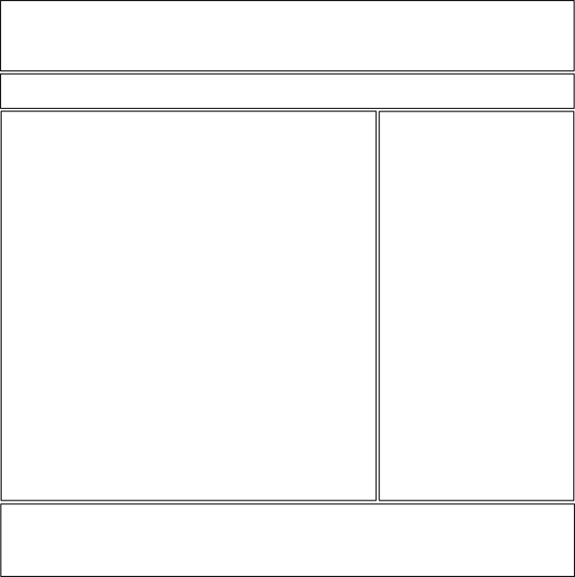
A simple web page
Our simple web page consists of some space at the top a for a logo and slogan etc., a horizontal menu, main content area, a sidebar and a footer. A simple sketch might look like this
So let's explore some options for building this with em and %. The first thing to do is to set up some basic html code for our page
	<div id="top">
	</div>
	<div id="navbar">
	</div>
	<div id="content">
	</div>
	<div id="sidebar">
	</div>
	<div id="footer">
	</div>
We will use the body element as page container on this case. It is normal to use a separate div element for this, but the body element also works.
The goal
The goal is to build a flexible layout with optimum readability that adapts well to different devices. We use a currently unspecified page width, and in relation to that, the main content area will take 70% and the sidebar will take 30%. The other areas are full width.
Readability
A quick check around the web reveals that the width of an average character is something like 0.6em and the optimum line length (for readability) is 50-75 characters. Let's target a maximum line length of 70 characters. We assume that one character is 0.6em so the length of 70 characters is 42em.
The main content
The main content area is the most important element and thus the first thing to look at. It should be 70% of the page width and we want a usable area that is maximum 42em. We need some spacing, let's say a horizontal padding of 1% on each side. We also need some distance to the sidebar, let's use 2% and take 1% each from the content area and the sidebar. That leaves 67% for our 42em and 100% will equal 63em. So to achieve our maximum 70 characters per line, we need a maximum page width of 63em.
The central parts of the layout can then be built using the following CSS:
body {
	max-width: 63em;
	margin: 0 auto;
	padding: 10px 1%;
	width: 98%;
}
#content {
	float: left;
	min-height: 300px;
	padding: 10px 1%;
	width: 67%;
}
#sidebar {
	float: right;
	min-height: 300px;
	padding: 10px 1%;
	width: 27%;
}
Current status
After some extra CSS code for visualizing the page elements and some dummy content, you might want to take a sneek peak at the example page. By maximizing the browser window and counting characters I see that there are appx. 70-75 characters per line so we are pretty close to our target.
So far, two columns will persist no matter how small the screen is (forget your little sneek peak now please) and we want it to collapse to one column at a set width. Let's target a minimum number of characters per line. And in this case in the sidebar since it is the smallest container. A target of 15 characters seems reasonable. This might be on the small side, but we don't want to loose our two columns too early either.
We have already concluded that 70 characters equals 42em so 15 characters equals 9em. And the usable area of the sidebar is 27% so we can use a browser width of 33em as a trigger point. At that point, our layout should collapse into a single column.
This CSS takes care of that
@media all and (max-width: 33em) {
	#content, #sidebar {
		float: none;
		width: auto;
		min-height: 0;
	}
}
Conclusion
By using just percentages and em, we have built a flexible layout that ensures a friendly line length and adapts well to different devices. And note that we haven't even specified a font size yet. This setup will adjust itself based on your the selected font sizes. That means that the layout also adapts well to differend device and user setting for font sizes.
And a final note. The calculations between em's, %'s and characters are not 100% accurate. For the real world you should take into consideration the font family that is used (wide fonts will lead to less characters for a given line length). The language of your website also affects the amount of text per line due to different distribution of the characters unless you use a monospaced font.