Multiple columns with CSS
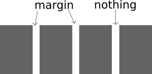
A setup I like for multiple column layout is to float each column to the left and use margin-right to create space between the columns. And then set margin right on the last two to zero and float the last one to the right. This technique leaves an area of absolutely nothing (not even margin or padding) between the two last columns so it takes more than a minor calculation error to make your layout fall apart. The same code can also be used for multi column grids, f.ex. displaying 12 products in a 4*3 grid.
The CSS code needed for this is conceptually as follows.
general-column-selector {
	float: left;
	margin-right: x;
}
first-column-selector {
	clear: both; /* Not needed if you only have one row */
}
second-last-column-selector {
	margin-right: 0;
}
last-column-selector {
	float: right;
	margin-right: 0;
}
A basic setup for multiple columns
This example will give us a four column grid with three rows.
<div class="multicol four">
	<div class="col"></div>
	<div class="col"></div>
	<div class="col"></div>
	<div class="col"></div>
	<div class="col"></div>
	<div class="col"></div>
	<div class="col"></div>
	<div class="col"></div>
	<div class="col"></div>
	<div class="col"></div>
	<div class="col"></div>
	<div class="col"></div>
</div>
The .four class is not really necessary at the moment but it comes in handy when you want to build other layouts than this basic four column grid. What's important now is that it is used for the CSS code that is specific for creating the four columns. And because of this we use the .four class in the general selector, width and margin-right will probably be different with other number of columns.
And then the CSS code:
/* general */
.col {
	background-color: #AAAAAA;
	min-height: 100px;
	float: left;
	margin-bottom: 20px;
}
/* general four-column */
.multicol.four .col {
	margin-right: 4%;
	width: 22%;
}
/* first column */
.multicol.four .col:nth-child(4n-3) {
	content: "first";
	clear: both;
	background-color: #999999;
}

/* second last column */
.multicol.four .col:nth-child(4n-1) {
	content: "second last";
	background-color: #CCCCCC;
	margin-right: 0;
}
/* last column */

.multicol.four .col:nth-child(4n) {
	clear: right; /* avoids some old ie problems */
	content: "last";
	background-color: #EEEEEE;
	float: right;
	margin-right: 0;
}
background-color, min-height and content are only included here to visualize the result.
Note how the nth-child selector is used to target the different columns. It should be easy to modify them to suit your desired number of columns. The backside of nth-child is that it is not supported in Internet Explorer 8 or older. We can fix this by adding classnames that denotes the column for each block.
<div class="multicol four">
	<div class="col col1"></div>
	<div class="col col2"></div>
	<div class="col col3"></div>
	<div class="col col4"></div>
	<div class="col col1"></div>
	<div class="col col2"></div>
	<div class="col col3"></div>
	<div class="col col4"></div>
	<div class="col col1"></div>
	<div class="col col2"></div>
	<div class="col col3"></div>
	<div class="col col4"></div>
</div>
And then add these classnames to the selectors for the first, second last and last columns.
So why use nth-child if dedicated classnames are necessary for most real-world scenarios? The nth-child solution is more flexible (you can change the number of columns without changing html code) and cleaner (less html code). And you can use Javascript to dynamically assign the extra classes for IE8 only, leaving the possibility for more dynamic columns (f.ex. change number based on page width) for more capable browsers.
Example code for this post including three and five columns.